How to Choose DTF Ink for Vibrant Colors and Reliable Transfer Results
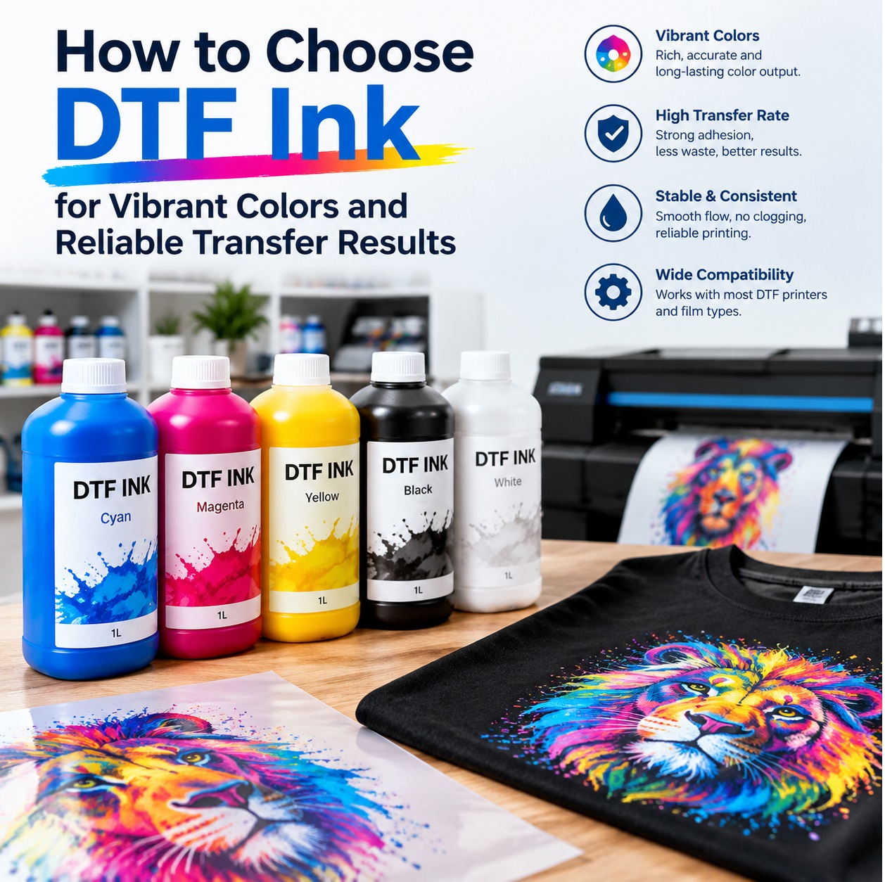 A DTF print that looks like a faded photocopy usually isn’t a printer problem. It’s an ink problem, and most buyers only discover that after they’ve ruined a roll of film, clogged a printhead, or watched a design crack after three washes. Choosing DTF ink isn’t about grabbing the cheapest bottle with “high color” on the label. It’s about matching chemistry, pigment load, and transfer behavior to the way you actually print.
I’ve watched plenty of shops chase the wrong fix. They tweak RIP settings, swap powders, blame the film, and still get muddy reds, weak whites, and transfers that feel like dry plastic. The ink was the weak link the whole time. If you want colors that pop and transfers that survive real life, you need to judge DTF ink like a production material, not a commodity.
Start with pigment quality, not price per milliliter.
Vibrant DTF output begins with how pigment is milled and dispersed. Cheap ink often uses larger particles that settle in the bottle, clog finer printhead channels, and produce a duller gamut. You might save a few dollars up front, then lose it in cleaning cycles, wasted film, and customer complaints. A good DTF ink has a high pigment load with stable dispersion. That means stronger color with less ink, cleaner gradients, and fewer nozzle dropouts during long runs.
Don’t trust a color chart printed on office paper. DTF color is built for transfer, powder, heat, and fabric. Ask for a printed sample on a black cotton shirt. Look at the reds first. Weak ink turns red into brick. Look at blues. Cheap ink pushes them purple or gray. Look at skin tones. If they look sickly, the ink is either underloaded or poorly profiled.
White ink is the backbone of the whole process.
On dark garments, every bright color sits on a white base. If the white ink is thin, chalky, or inconsistent, the final image will look washed out no matter how good the CMYK looks. Good DTF white ink lays down dense opacity without bulking up the print. It should jet smoothly, resist settling, and cure into a flexible film that accepts color evenly.
This is where marketing claims get slippery. “High opacity” means nothing if the white settles into concrete at the bottom of the cartridge. “Bright colors” mean nothing if the white base cracks when the shirt stretches. You want ink that stays homogeneous through the print run and produces a white layer that feels like part of the fabric, not a separate sheet of paint.
Compatibility beats brand loyalty.
Your DTF ink has to work with your printer, printhead, film, powder, and curing setup. A formula that runs beautifully in one shop can fail in another because the viscosity, surface tension, or resin chemistry doesn’t match. That doesn’t always mean the ink is bad. It means the system is mismatched.
Ask the supplier for technical data. Viscosity range. Particle size. Recommended film. Powder compatibility. Curing temperature and time. Shelf life. Storage conditions. If they can’t answer basic questions, they’re selling you a gamble. If they can, you’re already ahead of most buyers.
Curing turns ink into a transfer, and this step exposes weak formulas.
A DTF transfer has to do two jobs. It must release cleanly from the film, and it must bond permanently to the garment. Ink with the wrong resin package may look fine on the film and then peel, crack, or fade after washing. The powder melts into the ink, but the ink has to accept that powder and form a flexible network. If it doesn’t, you get transfers that feel greasy, stiff, or brittle.
Run a wash test before you commit to a full roll. Print a design with solid blocks, fine lines, and small text. Transfer it to a dark cotton shirt. Wait at least 24 hours. Then wash it inside out, dry it, and stretch it. Do it again. A reliable DTF ink should hold color, resist cracking, and stay soft. If the print fades or the edges lift, the ink is not production-ready.
Batch consistency is the quiet killer.
The first bottle can be perfect. The second bottle from a different lot can print like a completely different product. That kind of inconsistency destroys repeat business. Your customer orders the same shirt in five colors, and suddenly the reds don’t match. Your printer profile is fine. Your process is fine. The ink changed.
Look for suppliers who track lot numbers, provide certificates of analysis, and maintain tight quality control. Consistency is not a luxury in DTF. It is the difference between a print shop and a reprint factory.
A simple test will tell you more than any sales page.
Print a test file with rich primary colors, photographic gradients, one-pixel lines, and reversed-out text. Check for color vibrancy, edge sharpness, and white opacity. Transfer it to black cotton. Stretch the fabric. Scratch the print with your fingernail. Wash it. Compare it to a known good ink. If it passes, you have a contender. If it fails, no discount is worth the headache.
The right DTF ink should make your prints look expensive and behave predictably. It should give you reds that stop people scrolling, whites that hold their ground, and transfers that survive the washing machine without drama. Saving pennies on ink is easy. Building a reputation on prints that fade, crack, or look muddy is expensive. Pick the ink that makes your best prints repeatable, and your customers will do the marketing for you.